<p>After some testing, the new colours somehow feel a bit, well how should I put it, annoying. Please don't get me wrong, I still find the idea cool, yet it could be made bit less obtrusive, i.e. giving a user some indication there's some colour without adding too much distraction.</p>
<p>The only idea I could come up with was to use different opacity value depending on where the mouse is. This may be a stupid idea to start with, and add even more confusion for a normal user. Maybe other don't find it distracting as it is right now?</p>
<p><a target="_blank" href="https://user-images.githubusercontent.com/5842757/37622828-150f44aa-2bc3-11e8-9ccf-c0a966372303.png"><img src="https://user-images.githubusercontent.com/5842757/37622828-150f44aa-2bc3-11e8-9ccf-c0a966372303.png" alt="grafik" style="max-width:100%;"></a></p>
<p>Opacity value of 0.1 instead of 0.4:</p>
<p><a target="_blank" href="https://user-images.githubusercontent.com/5842757/37623153-fe86e138-2bc3-11e8-8a27-2fcf21b2ab39.png"><img src="https://user-images.githubusercontent.com/5842757/37623153-fe86e138-2bc3-11e8-8a27-2fcf21b2ab39.png" alt="grafik" style="max-width:100%;"></a></p>
<p>When focusing on the key/value pair block, the colours are shown with opacity 1 again, like before.</p>
<p><a target="_blank" href="https://user-images.githubusercontent.com/5842757/37622585-5944f0da-2bc2-11e8-93bd-9b8790ce9b7a.png"><img src="https://user-images.githubusercontent.com/5842757/37622585-5944f0da-2bc2-11e8-93bd-9b8790ce9b7a.png" alt="grafik" style="max-width:100%;"></a></p>
<pre><code>--- a/app/assets/stylesheets/common.scss
+++ b/app/assets/stylesheets/common.scss
@@ -1219,9 +1219,17 @@ tr.turn:hover {
margin: 0px;
border: 1px solid rgba(0, 0, 0, .1);
// add color via inline css on element: background-color: <tag value>;
+
+ transition: opacity 0.1s ease-out;
+ opacity: 0.4;
}
}
+ .browse-tag-list:hover .colour-preview-box {
+ display:block;
+ opacity: 1;
+ }
+
.warning {
margin: 0 0 $lineheight/2 0;
padding: 0 $lineheight/2;
</code></pre>
<p style="font-size:small;-webkit-text-size-adjust:none;color:#666;">—<br />You are receiving this because you are subscribed to this thread.<br />Reply to this email directly, <a href="https://github.com/openstreetmap/openstreetmap-website/pull/1779#issuecomment-374383221">view it on GitHub</a>, or <a href="https://github.com/notifications/unsubscribe-auth/ABWnLfsv9vUrIIYiFNYwGp1FNyfExptCks5tgCG6gaJpZM4Sdsny">mute the thread</a>.<img src="https://github.com/notifications/beacon/ABWnLRRx5LeNRyaaE8hr_sAk15vUSX_Dks5tgCG6gaJpZM4Sdsny.gif" height="1" width="1" alt="" /></p>
<div itemscope itemtype="http://schema.org/EmailMessage">
<div itemprop="action" itemscope itemtype="http://schema.org/ViewAction">
<link itemprop="url" href="https://github.com/openstreetmap/openstreetmap-website/pull/1779#issuecomment-374383221"></link>
<meta itemprop="name" content="View Pull Request"></meta>
</div>
<meta itemprop="description" content="View this Pull Request on GitHub"></meta>
</div>
<script type="application/json" data-scope="inboxmarkup">{"api_version":"1.0","publisher":{"api_key":"05dde50f1d1a384dd78767c55493e4bb","name":"GitHub"},"entity":{"external_key":"github/openstreetmap/openstreetmap-website","title":"openstreetmap/openstreetmap-website","subtitle":"GitHub repository","main_image_url":"https://cloud.githubusercontent.com/assets/143418/17495839/a5054eac-5d88-11e6-95fc-7290892c7bb5.png","avatar_image_url":"https://cloud.githubusercontent.com/assets/143418/15842166/7c72db34-2c0b-11e6-9aed-b52498112777.png","action":{"name":"Open in GitHub","url":"https://github.com/openstreetmap/openstreetmap-website"}},"updates":{"snippets":[{"icon":"PERSON","message":"@mmd-osm in #1779: After some testing, the new colours somehow feel a bit, well how should I put it, annoying. Please don't get me wrong, I still find the idea cool, yet it could be made bit less obtrusive, i.e. giving a user some indication there's some colour without adding too much distraction.\r\n\r\nThe only idea I could come up with was to use different opacity value depending on where the mouse is. This may be a stupid idea to start with, and add even more confusion for a normal user. Maybe other don't find it distracting as it is right now?\r\n\r\n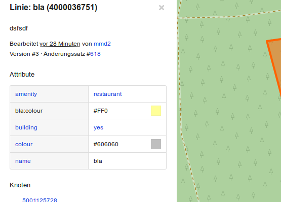\r\n\r\nOpacity value of 0.1 instead of 0.4:\r\n\r\n\r\n\r\n\r\nWhen focusing on the key/value pair block, the colours are shown with opacity 1 again, like before.\r\n\r\n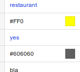\r\n\r\n\r\n\r\n```\r\n--- a/app/assets/stylesheets/common.scss\r\n+++ b/app/assets/stylesheets/common.scss\r\n@@ -1219,9 +1219,17 @@ tr.turn:hover {\r\n margin: 0px;\r\n border: 1px solid rgba(0, 0, 0, .1); \r\n // add color via inline css on element: background-color: \u003ctag value\u003e;\r\n+\r\n+ transition: opacity 0.1s ease-out;\r\n+ opacity: 0.4;\r\n }\r\n }\r\n \r\n+ .browse-tag-list:hover .colour-preview-box {\r\n+ display:block;\r\n+ opacity: 1;\r\n+ }\r\n+\r\n .warning {\r\n margin: 0 0 $lineheight/2 0;\r\n padding: 0 $lineheight/2;\r\n```\r\n\r\n\r\n\r\n\r\n\r\n"}],"action":{"name":"View Pull Request","url":"https://github.com/openstreetmap/openstreetmap-website/pull/1779#issuecomment-374383221"}}}</script>