[openstreetmap/openstreetmap-website] Improve link and button styles (#2716)
Wille Marcel
notifications at github.com
Sun Jul 19 09:29:45 UTC 2020
@gravitystorm [suggested me](https://twitter.com/gravitystorm/status/1283697101977923590) to open an issue to discuss link/button styles.
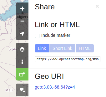
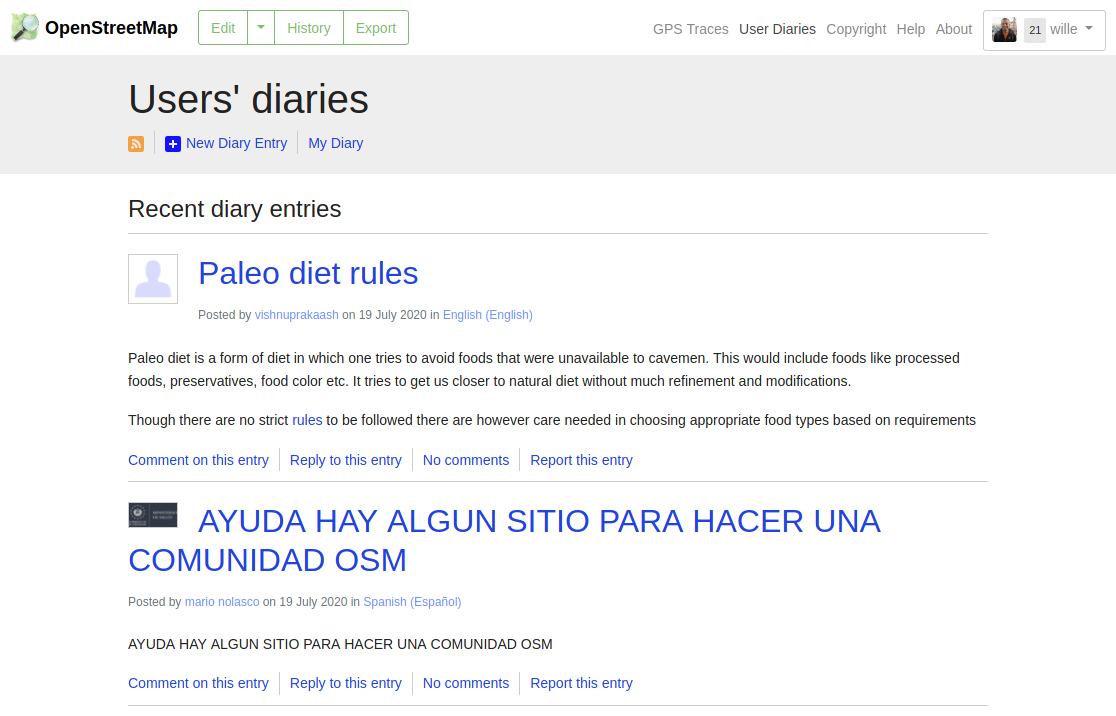
I think we need a better colour palette definition to the website. We have 2 blue tones to buttons and links, and they don't combine well with other parts of the website. Some examples:
- Share map active button is green. Link active button is blue. The `geo` link (`#24d`) adds a third blue tone to the screen and looks like an unformatted link.
- On the Diaries, the blue colour for the links doesn't look harmonic with other colours on the page. The + button is darker than the buttons we see in other parts of the website.
--
You are receiving this because you are subscribed to this thread.
Reply to this email directly or view it on GitHub:
https://github.com/openstreetmap/openstreetmap-website/issues/2716
-------------- next part --------------
An HTML attachment was scrubbed...
URL: <http://lists.openstreetmap.org/pipermail/rails-dev/attachments/20200719/d74feaa0/attachment-0001.htm>
More information about the rails-dev
mailing list