[openstreetmap/openstreetmap-website] Improve margin of changeset number and comments (#3305)
Adamant36
notifications at github.com
Sun Aug 29 23:39:09 UTC 2021
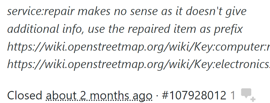
Can you please increase the margin between the changeset number and the number of comments next to it or make the number of comments darker? Because they aren't currently far away from each other to tell them apart well. The 1 being grey helps some, but it's not that easy to see it's grey on the actually website along with everything else. It just blends in with the other numbers next to it.

--
You are receiving this because you are subscribed to this thread.
Reply to this email directly or view it on GitHub:
https://github.com/openstreetmap/openstreetmap-website/issues/3305
-------------- next part --------------
An HTML attachment was scrubbed...
URL: <http://lists.openstreetmap.org/pipermail/rails-dev/attachments/20210829/137d6a71/attachment.htm>
More information about the rails-dev
mailing list