[openstreetmap/openstreetmap-website] Added color preview box in tag browser sidebar (#1779)
mmd
notifications at github.com
Mon Mar 19 21:23:06 UTC 2018
After some testing, the new colours somehow feel a bit, well how should I put it, annoying. Please don't get me wrong, I still find the idea cool, yet it could be made bit less obtrusive, i.e. giving a user some indication there's some colour without adding too much distraction.
The only idea I could come up with was to use different opacity value depending on where the mouse is. This may be a stupid idea to start with, and add even more confusion for a normal user. Maybe other don't find it distracting as it is right now?
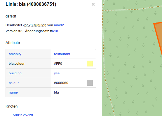
Opacity value of 0.1 instead of 0.4:

When focusing on the key/value pair block, the colours are shown with opacity 1 again, like before.
```
--- a/app/assets/stylesheets/common.scss
+++ b/app/assets/stylesheets/common.scss
@@ -1219,9 +1219,17 @@ tr.turn:hover {
margin: 0px;
border: 1px solid rgba(0, 0, 0, .1);
// add color via inline css on element: background-color: <tag value>;
+
+ transition: opacity 0.1s ease-out;
+ opacity: 0.4;
}
}
+ .browse-tag-list:hover .colour-preview-box {
+ display:block;
+ opacity: 1;
+ }
+
.warning {
margin: 0 0 $lineheight/2 0;
padding: 0 $lineheight/2;
```
--
You are receiving this because you are subscribed to this thread.
Reply to this email directly or view it on GitHub:
https://github.com/openstreetmap/openstreetmap-website/pull/1779#issuecomment-374383221
-------------- next part --------------
An HTML attachment was scrubbed...
URL: <http://lists.openstreetmap.org/pipermail/rails-dev/attachments/20180319/c364e9e4/attachment-0001.html>
More information about the rails-dev
mailing list